De Stijl – Neo-plasticisim

De Stijl started off as a magazine in 1917 by two of the founders Piet Mondrian and Theo van Doesburg. De Stijl me style in dutch. The magazine became a place for both of the artist to put their views on art out into the world. The first time that the term Neo-plasticisim (new art) was used was in one of the first issues of the magazine which became the name of the artwork that they were making.

One of the main aspects that the Neo-plasticisim movement held was the use of minimal colours and the use of only vertical and horizontal lines and shapes no curves or circles


Different mediums – ink and plastic

today we have started experimenting with different type of mediums this one is ink and plastic

we started by going to the library and finding a photo of something. I decided to go with someone walking as I thought it looked cool.

we then took that image and put a sheet of plastic over the top of it and with some special tools we scraped over the top of the plastic to make  an etching into the plastic

we then took the etching to a special room in which we covered the plastic sheet with a thick ink and started to take the ink off by rubbing it down and taking it away with cotton buds to give it definition and tone and make it so the light is hitting it

we then put it in a press to press the ink into the paper and when it went through the press it leave the ink on the paper

Assignment 1 – Considered Composition

Assignment 1 – Considered Composition

For my first major assignment, we were tasked with designing a new logo for the desired charity and the one I have gone for is mental health UK. I have chosen this one as it is a charity that is close to my heart and one that I have used in the past.

the first thing that we had to do was research the core values of the charity and this is what i came up with.

The core values of the mental health foundation are to prevent and finding the sources of the health issues and actively fight them. One in six people in the past week have had experienced a mental health issue. Another key ethos that they imply is that everyone is entitled to good mental health whether you are young or old.

They also try and identify the patterns of mental health issues and what causes them to happen in the first place. After they have all the necessary information they will then use it to research new techniques and approaches on tackling mental health and then they can offer people correct advice  

They also are trying to change people’s views on mental health. That’s it’s not something people are making up for attention and that it is a real issue faced by millions of people. They also attack the issue in schools by actively going to the schools and helping the young people at the source.

They also aim to help older people by helping them to deal with and overcome their issues. They also work within the workplace to educate and inform people about the signs if someone has mental health issues and they can help them.

FINAL IMAGE

for my final image I wanted to go with something that really drives home the point that the disability is hidden and that people who suffer for mental health may look fine on the outside but on the inside they are not finemental healthposter 2updated

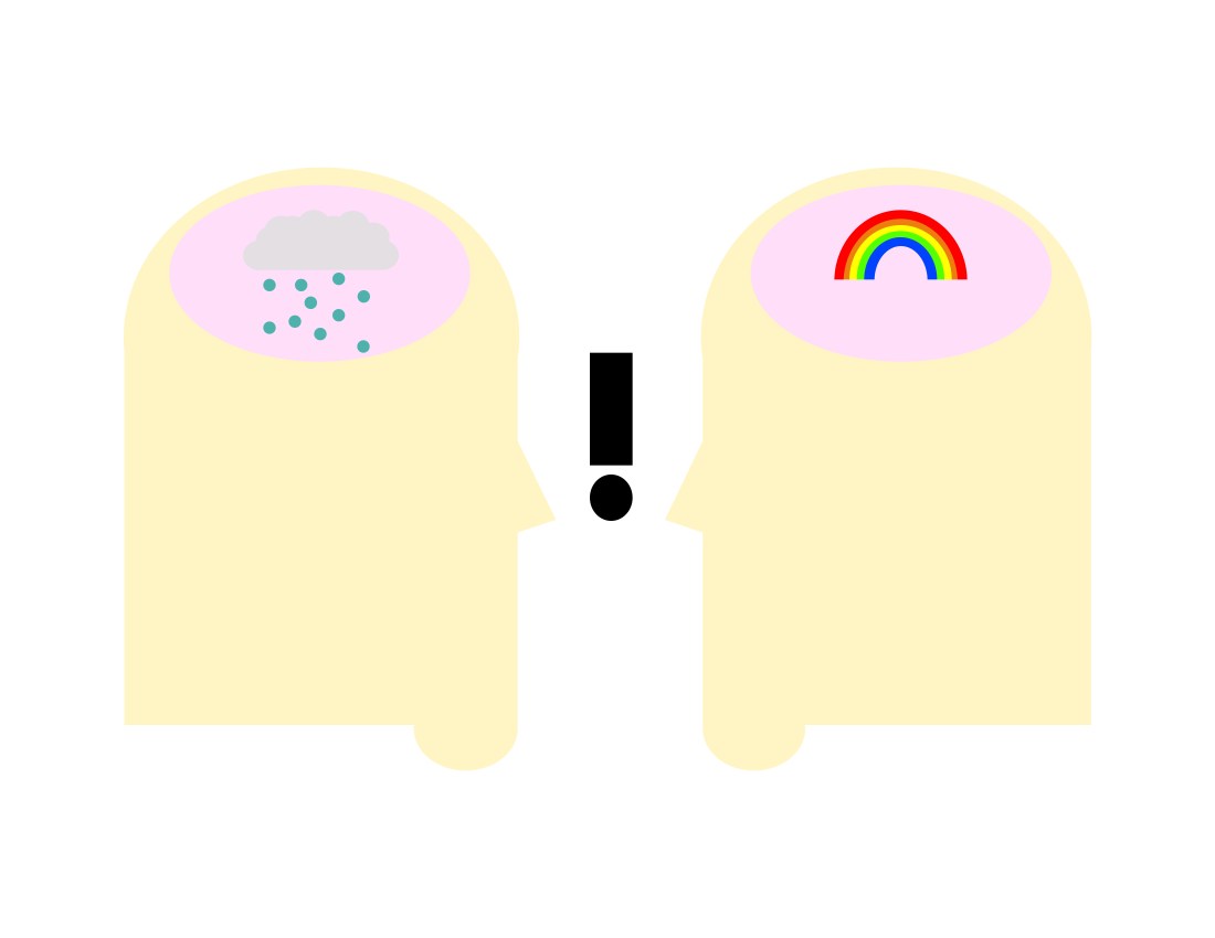
I also have added an exclamation mark as when people learn about people who have a mental health issue they are shocked as the person with the mental health they look fine and healthy on the outside.


Gestalt theory


Nike_logo_emblem_logotype

NIKE LOGO

the first logo I have chosen is the Nike logo. Personally, I think that the Nike logo is one of the best logo not to use gestalts theory is the Nike logo. The reason I like this design is the pure simplicity of the design and how it is easily recognizable it is at a quick glance. One of the things that I dislike about the logo is also how simple it is. If you have never heard of Nike and you saw this on the side of a building you would have no idea what the brand is and what they are trying to sell you.


492px-Louis_Vuitton_logo_and_wordmark.svg

The second logo I have chosen is the Louis Vuitton. I really like this logo as it is very angular which makes it stand out as not many logos use that style. It also uses a very bold font that stands out and makes it easily recognisable at a quick glance. One thing I don’t like about the logo is the overlap of the letters as I think that it makes it too confusing to look at. It makes other letters that have nothing to do with the brand and the logo such as an x where the L and the V cross over.


The target audience for this brand is people who are willing to spend a lot  money on clothes i get this feeling as the logo looks very sophisticated and simple

Bic-Logo-768x320

The last logo i have chosen is the BIC pen logo. One of the things that I like about this logo is the font used. It looks like the font has been drawn with a pen which links the two together. I also like the way the font is tilted and to the side. I also like the  little mascot on the left i really like the head of the mascot as his head is like the ball in a ball point pen which is another thing that links the logo back to pens.

One of the things i don’t like is the colours used. The orange doesn’t add anything and in most parts takes away from the logo such as the way the orange is in the back of the main section of the logo

Josef Albers colour theory

Josef Albers was a German-born American artist who was born in 1888 and before moved to the Bauhaus he taught at a local elementary school in his hometown. later on, in life, he was praised for his abstract art painting throughout his time at the Bauhaus.

The Bauhaus was an art academy in Germany in which like-minded people would come and train together to push what people think of art. He was the first student to be invited back as a teacher to Bauhaus. One of the major aspects that he dedicated himself to was studying the way colours affect each other and how they interact with each other.

He said that colour is always being seen in relation to what is surrounding it. It is very hard to see colour in isolation and not to see it with its surroundings.

For instance, this images both of the green in the middle is the same colour. It looks like 2 different colours and that is because the colour in the background makes it seem like 2 different colours. He said that colour is understood through experience. colour is absolute and that it is always relative to its surroundings.

I find the work of Josef Albers incredibly interesting. This is mainly due to the fact how I have learned to incorporate some of the key aspects of his colour theory into my work. one example is with the toucan logo.

toucan music exchange project

into days lesson we were tasked with designing a logo for the toucan music exchange club which is a jazz club in Cardiff.

the first thing that we did was to try and learn illustrator as that is the package that we designed our logo in. We did this by getting existing logos and tracing over them using the pen tool.

After we had learned how to use the pen tool to a semi-decent level we put our first drafts together in illustrator. We then took the logo we had made and then started to simplify them by drawing them out on paper taking away the thing that was not needed such as in mine I had a line drawing of both a toucan and the coal exchange which was really too complicated and over the top.

I made the logo simpler by just taking the basic shapes of a toucan which I think are the beak eye and the back so I took them simple shapes and I made a logo out of them. the colour that I used is also to keep it simple that is why I chose only to use red and yellow. I chose them as they are the main colours of a toucans beak.

I really liked this small assignment that we had to do. with all of the different aspects of it such as starting to learn illustrator and learning how to do design properly such as starting on paper and making the design as simple as possible. Another aspect that I liked is the feedback we got of the client and the other people in the class